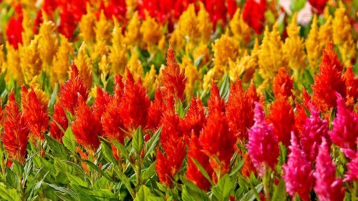
The season for planting annuals has just about wrapped up. Gardens and planter boxes will be spilling with vibrant hues over the next few months – beautiful colour compositions to excite the senses for summer. Exciting to look at, yes – but how do we feel when we experience individual spaces splashed with such complexions?
Colour Psychology is a study used extensively in design and marketing. Colour is a powerful tool. It can be a determinant of human behaviour. It can influence perceptions and facilitate certain moods and emotions. In branding marketers use colour in a way that will connect the right demographic of consumer to a particular product or service. Subsequently a colour that represents a brand will have been chosen to reflect the personality of the product. The same can be said for window displays and advertising. Research has shown that warm colours tended to attract spontaneous purchasers, despite a larger percentage of any given demographic choosing cooler colours as being more favorable. Here at Gelderman we hear a lot of potential clients mentioning the reason they called was because they saw our bright red trucks with our yellow logo – yellow being a colour which they human eye tends to react to first.
How can this field of study be applied to the landscape of your community, home or office? Consider the type of mood you are trying to target. Planting seasonally specific, mood-targeting colours will help stimulate the emotions and senses of potential customers. Cool colours will tend to be more calming while warm colours will excite and energize. For instance, commercial buildings should use bright, hot colours to attract attention. Red, yellow and orange will garner the most attention from traffic passing by. Utilize these colours around front entrance signage. Seeing as yellow is the first colour the human eye reacts to, use it to frame your flowerbeds most visible from the road. A property manager might benefit from this type of planting. It would steer the attention away from the property next door and directly to yours. Blues and purples planted within the interior common areas will sooth and relax residents and provide a sense of security. Mixing warm and cool colours has another combination of beneficial attributes when used in an office complex or corporate campus. Cool colours have proven to reduce stress and can be applied to break areas to allow employees to recharge. They are refreshing, formal and elegant. Outdoor patios planted with the colors of fire can spark idea generation and ignite productivity.
The influence color has on perceptions varies drastically from person to person. Many other factors come into play at this point. However, in this way the characteristics of colour can be applied to numerous other atmospheres. Orange being known to stimulate appetite is well suited for a restaurant – planted in urns, hanging baskets, or garden beds along the patio. Relating to the feel of space shades of blue can make a small environment feel open while shades of red will cozy up a large courtyard. The use of color in seasonal planting is obvious. Not so obvious is the connotation of color and its role in themeing. The various colours of Chrysanthemum have been used to reflect the Fall Harvest. Red is the colours of revolution. Green may connote a sense of freshness. Add an element of play and whimsy with a mixture of bright colours.
Landscaping is more than just plants and shrubs. Landscaping is about designing a space and developing the land as if it were a blank canvas. Plant the same way a painter would paint and have some fun with colour.
Find out about annuals and other landscape enhancement services we offer our commercial clients [here](https://gelderman.com/commercial/construction).
*Post contributed by [Adam Braun](https://gelderman.com/company/team/58/adam-braun), Guelph Branch Construction Crew Leader*
For any questions or comments please comment on our
[Facebook](https://www.facebook.com/GeldermanLandscapeServices) page.


